

Showing posts with label Friday Album Cover. Show all posts
Showing posts with label Friday Album Cover. Show all posts
25 February 2011

28 January 2011
Blue Note T-shirts

07 January 2011
Friday Album Cover: Best of 2010
Inspired by the good folks at Accujazz, I decided to throw in my 2 cents and list my favorite album covers of 2010, with some commentary where applicable. As I've mentioned before, good album art cannot make up for bad music, but a good cover can give an album I like some extra juice. Below are my picks.
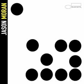
Jason Moran

A throwback to the classic Blue Note album covers of the 1960s, with sans serif typography and a minimalist design. What's not to love?
The rest of my picks after the jump.
03 September 2010
Friday Album Cover: Alternate Universe
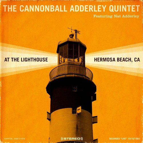
Jazz and Design linked to some alternate covers to classic jazz recordings by Jeff Rochester this morning, including the version of Cannonball Adderley's At The Lighthouse below. See more of his work, including a delightfully minimalist Blood on the Tracks cover, here.
23 July 2010
Friday Album Cover: Rubber Soulive

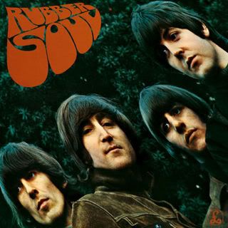
This week I learned via Nextbop that acid jazz trio Soulive will release a Beatles tribute in September titled Rubber Soulive. The cover for the album (above), is a wonderfully minimalist homage to the distinctive psychedelic font found on the Beatles' Rubber Soul (below). While I don't yet know whether I will like the album, I wholeheartedly approve of the cover.
18 June 2010
Friday Album Cover: Video Edition
04 June 2010
Friday Album Cover: Night of the Cookers

RT @atane Freddie Hubbard & Lee Morgan - The Night of Cookers - Man this joint is sizzling!! #jazz #vinyl http://twitpic.com/1tedk3
26 March 2010
Friday Album Cover: Holland/Troxler
Dave Holland released his latest album, Pathways, this week, and had this to say about his cover art on his blog:
Always nice to hear an artist discuss cover art. Holland clearly believes as I do that interesting cover art adds to the experience of an album. After the jump is some of Troxler's recent cover art for Holland.
I have heard quite a few compliments about the distinctive cover art for my Dare2 releases. When I started the label, I knew I wanted my good friend, the world-famous graphic designer Niklaus Troxler, to do the artwork.
I first met Niklaus during the early 1970s. With the help of family and friends, he was organizing concerts in his hometown of Willisau, Switzerland—an activity that began because of his love of music. These would become the annual Jazz in Willisau festival. I immediately liked his directness and his positive energy, and discovered in him a wonderful sense of humor and intensity of purpose.
So many great images come to mind. Once, I was in Willisau to play a solo concert on a double bill with the Ron Carter Quartet. When we arrived at the hall, we were greeted by 20 large posters in a line across the entrance doors, each showing a lilac bass against a yellow background, with an arm at each shoulder of the bass playing the strings. On another occasion, a poster for a concert by Sam Rivers showed a pink fish jumping out of the bell of a tenor saxophone! Niklaus' posters are full of bold colors—Niklaus himself favors clothes with colors and combinations of equal intensity.
For the release of Pathways, in addition to a standard CD, we collaborated with Niklaus and Grammy-award winning package designer Susan Archie (Albert Ayler: Holy Ghost, Screamin' and Hollerin' the Blues: The Worlds of Charley Patton), to create a limited edition set (1,000 copies). This edition of Pathways comes in a 5" x 7" lidded box containing six postcard-sized reproductions of concert posters designed by Niklaus, including a poster commemorating the octet’s recording of Pathways live at Birdland in 2009. This set includes posters for concerts by Gateway, Anthony Braxton, Sam Rivers, and the double bill with Ron Carter mentioned above. The CD comes in a 4-panel folder decorated with Niklaus’ art, as well.
I hope you enjoy his art as much as I do—and don't forget to pay attention to the music!
Always nice to hear an artist discuss cover art. Holland clearly believes as I do that interesting cover art adds to the experience of an album. After the jump is some of Troxler's recent cover art for Holland.
05 February 2010


11 December 2009
Bonus Friday Album Cover
Yesterday Patrick Jarenwattananon informed us that Justin Vernon's (of Bon Iver) recent benefit performance with his high school jazz band was recorded and now is for sale. I haven't listened to any samples yet, but check out the album cover:
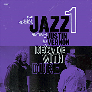 Referencing the Blue Note Special, but distinctive. Simple, but effective.
Referencing the Blue Note Special, but distinctive. Simple, but effective.
20 November 2009
Friday Album Cover: In My Element

 In a recent interview on Jason Crane's The Jazz Session, Robert Glasper said something that revealed the inherent trickiness in playing hip hop-flavored jazz:
 "As far as I know, most people, you know, when they do do an electric album, it's after they finish doing their acoustic stuff and then they do an electric album."At the risk of digging too deeply into one sentence from an hourlong interview, it seems like Glasper is implying that if you want to be taken seriously as a jazz musician, you have to start out by playing acoustic jazz. I will not argue with Glasper here, some people will still reflexively dismiss a musician who only plays fusion, and not any kind of straightahead postbop (those people were a convenient straw man to one side in the jazz wars of the 1980s and 1990s). Instead, what interests me is how this line of thinking can be extended to album art as well.
A while back, I examined a common template used on Blue Note album covers during the 1950s and 1960s, which I dubbed the "Blue Note Special." The cover to Glasper's In My Element features many characteristics of the Blue Note Special, including black-and-white photography, minimal text, the color blue, and a simple layout. That Glasper would reference such a classic design makes sense when considering the style of this album (which I would roughly classify as an adventurous postbop album) and his comment that jazz musicians often hew more closely acoustic jazz during the early stages of their careers. It is as if Glasper wanted to make sure we know that he is both referencing and updating a jazz tradition. In this case, the art, and the album itself, manage to deftly point forward while referencing a revered tradition: the classic Blue Note album covers of the 1950s and 1960s and the adventurous hard bop that filled the label's catalogue during that era.
06 November 2009
Friday Album Cover: Reid Miles meets RZA and Raekwon

Designer Robert Newman has reimagined a number of Wu-Tang Clan album covers as Blue Note covers. Check it out. Well done, Robert!
h/t: Jack Shafer's twitter
23 October 2009
A Very Special Friday Album Cover
 Today the British newspaper The Independent reviews Freedom, Rhythm and Sound
 by Gilles Peterson and Stuart Baker, a compendium of rare jazz cover art from the 1970s. Many of the covers in the book reflect the Black Power aesthetic of pride in blackness, signifying on African and African American cultural forms and tropes.
You can view a slideshow of some of these album covers here. The book makes a great holiday gift for any album coverphile you know.
h/t: jazz.com
17 July 2009
Good Gracious
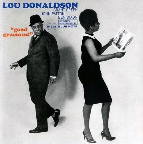 From If Charlie Parker Was a Gunslinger, There'd Be a Whole Lot of Dead Copycats comes this Blue Note cover for Lou Donaldson, who wasn't concerned with the world knowing he was a lecherous creep. Such were the early 1960s...
In other corners of the jazz blogosphere:
- At jazz.com, Maria Schneider discusses her twelve favorite Gil Evans tracks.
- Darcy James Argue links a YouTube of Clark Terry playing live with the Wayne Shorter Quartet in 1986. Though Wayne was playing in a fusion vein at the time, Terry does not miss a step. There's a reason Miles Davis treated Terry so reverently in his memoirs; the man can still play with anybody who comes his way.
- Ethan Iverson reviews Douglas Henry Daniels’ Lester Leaps In: The Life and Times of Lester "Pres" Young, a new bio of Lester Young, and offers some good thoughts on the multitude of approaches to jazz criticism. Ethan also recently posted a massive interview with Tim Berne that is worth your time.
- Dave Douglas recently guest posted at A Blog Supreme, writing about the business of jazz in a changing economic climate. Elsewhere at NPR, the All Songs Considered blog takes a look at some legendary New Orleans pianists.
- Ted Gioia discusses a recent NEA study which suggests that the audience for jazz is both shrinking and aging.
- At WBGO, Dave Brubeck discusses the legacy of his 1959 album Time Out.
- Night Lights has an extensive interview with jazz scholar John Gennari. John's book is essential reading for anyone interested in the history and development of jazz criticism.

 is essential reading for anyone interested in the history and development of jazz criticism.
22 May 2009
Out There...

 Sun Ra gets all the credit for fostering an Afronaut aesthetic within jazz, but one look at this cover from Eric Dolphy's 1960 album Out There shows that other musicians were also thinking about boldly going where no man had gone before. The metronome weirdly foreshadows the monolith from 2001: A Space Odyssey, don't you think?
Elsewhere in the jazz world...
- Howard Mandel ponders the dearth of female jazz fans, asking men to perhaps be a bit more inclusive and less misogynistic when it comes to jazz.
- Groove Notes posted an audio interview with Billy Hart on the murder of Lee Morgan.
- Philip Stein, an artist who created the mural that graces the back wall of the Village Vanguard, died last month. He was 90.
He was the sister of current Vanguard owner Lorraine Gordon. - You can now listen to archived performances from Smalls Jazz Club online (h/t All Music Blog).
- NPR has started its own jazz blog, and came up with a fantastic name, A Blog Supreme.
- Coming Soon! Kind of Bloop: An 8-Bit Tribute To Miles Davis.
- ESPN.com Special Correspondent Paul Shirley on basketball and jazz. The basketball/jazz comparison can be a bit tired, but Shirley adds new depth to the relationship. Now I have an excuse to post one of my favorite quotes from the American version of The Office. In a deleted scene from episode 1.05 ("Basketball"), Michael Scott ruminates:
And basketball is like jazz, you know. To like pertipify it there's a jazz musician, a guy, you know... if you know jazz you know who I mean. He's uh, God what was his name? Um, he plays one of those curly horns, like those really shiny curly horns that's used in jazz a lot.
Image via Monthly Top Ten
17 April 2009
Friday Album Cover: Prestige Records
Blue Note Records has often been the subject of Friday Album Covers, but Blue Note was not the only label creating beautiful album art during the 1950s and 1960s. Below are two of my favorite covers from Prestige Records, which produced plenty of great hard bop albums by Miles Davis, Sonny Rollins, and Thelonious Monk, among many others.
 Saxophone Colossus very much resembles the Blue Note Special, except the image of Rollins looks more like a silhouette than a tinted black-and-white photo.
 Featuring a crisp image of a stoplight with clean typography, Walkin' is distinctive much in the same way so many Blue Note albums were.

 Saxophone Colossus very much resembles the Blue Note Special, except the image of Rollins looks more like a silhouette than a tinted black-and-white photo.
 Featuring a crisp image of a stoplight with clean typography, Walkin' is distinctive much in the same way so many Blue Note albums were.
13 February 2009
Links
 Those hard bop posts took a long time, so I'm taking the weekend off. Enjoy the links, see you next week...
- One of my favorite time-wasters is If Charlie Parker Was a Gunslinger, There'd Be a Whole Lot of Dead Copycats. They have plenty of photo collections for any taste, but two that potentially of interest to readers of this blog are The Art of Jazz and The Friends of Milt Hinton, featuring the photography
of the great bassist. Bonus points for anyone who can guess the reference in the blog's title...
- Nat Hentoff has begun writing for jazz.com. Here's his first contribution, on Nesuhi Ertegun and Joel Dorn.
- Have you ever read any of Brad Mehldau's prose? He's quite a thoughtful writer, and many of his writings are posted on his website (you can also download his complete works on a pdf here).
- Just in time for Valentine's Day, Night Lights will be looking at some husband-and-wife teams in jazz on tonight's show.
- Since today is Friday the 13th, I wanted to post a video of Monk playing his tune of the same name (from his Prestige date with Sonny Rollins), but there is no video to be found on YouTube. Instead, here is a trio recording of Friday the 13th performed by Avram Fefer on saxophone, Michael Bisio on bass, and Igal Foni on drums.
23 January 2009
Miscellany
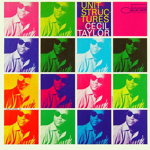 Nothing new, just links and an album cover (it is Friday, after all).
- Ted Panken at jazz.com sits down for a talk with Bill Frisell and Ron Miles. Also on jazz.com, Ethan Iverson of The Bad Plus offers up his twelve most essential stride piano tracks, mixing in some post-World War II takes on the style with the expected selections from the catalogues of Art Tatum, Earl Hines, James P. Johnson, et al.
- Destination: OUT gives us a three-part series of posts remembering the 1980s. They linked one of my recent posts, which was nice. That's all I have to say about that.
- Over at JazzWax, Marc Myers interviews Buddy DeFranco about the 1949 Metronome All-Stars sessions.
- Earlier this month, the New York Times had a little Q-and-A for its readers with jazz critic Ben Ratliff.
- From the WBGO Blog, Robert Glasper performs "Enoch’s (Inaugural) Meditation" for President Obama.
- I watched One Night With Blue Note the other day on Netflix, and quite enjoyed the clip of Jackie McLean performing "Appointment in Ghana" with Woody Shaw, McCoy Tyner, Cecil McBee, and Jack DeJohnette:
16 January 2009
Friday Album Cover: Talkin' About!
Grant Green
Talkin' About!
 Blue Note's album catalog is so large that every so often I will come across an interesting album cover that I had never seen before. Such is the case with Grant Green's Talkin' About, which I did not know even existed until I saw it featured on Into the Rhythm this morning. The cover follows the traditional Blue Note motif (black-and-white photo, sans-serif text, minimalist theme), but adds a wrinkle with the album's title adding it to the album's song titles. This gives the cover kind of a vernacular feel to it, highlighting Green's bluesy aesthetic. The album also claims, "You'll be talkin' about it too!," a not-so-subtle endorsement reminiscent of Everybody Digs Bill Evans. All in all, the cover is a winner.
Talkin' About!
Blue Note's album catalog is so large that every so often I will come across an interesting album cover that I had never seen before. Such is the case with Grant Green's Talkin' About, which I did not know even existed until I saw it featured on Into the Rhythm this morning. The cover follows the traditional Blue Note motif (black-and-white photo, sans-serif text, minimalist theme), but adds a wrinkle with the album's title adding it to the album's song titles. This gives the cover kind of a vernacular feel to it, highlighting Green's bluesy aesthetic. The album also claims, "You'll be talkin' about it too!," a not-so-subtle endorsement reminiscent of Everybody Digs Bill Evans. All in all, the cover is a winner.h/t: Into the Rhythm
02 January 2009
Friday Album Cover: Serious Music
Let's get 2009 started on the right foot, with a Friday Album Cover. One of the dominant narratives of jazz history has been the struggle for acceptance of jazz as a high art. From the early days of jazz, when Duke Ellington was calling his music an African American art, to the academization of jazz after the 1960s, jazz musicians have defined their music as an art form, and not simply a folk or popular music. Some musicians have used album art to present themselves as serious musicians who have worked painstakingly hard to develop their music.
As I wrote earlier this year, Charles Mingus used this technique on the cover on his album Blues and Roots, released in 1959. Around the same time, avant-garde wunderkind Ornette Coleman posed with his quarter for the cover to his album This Is Our Music . The album cover was a self-conscious presentation of something new in the jazz world. It tells the viewer/listener that whatever he or she thinks about it, the music of Coleman and his band is their own artistic expression that deserves to be taken seriously.

Almost thirty years after Coleman, another wunderkind, trumpeter and spokesperson for the Young Lions Wynton Marsalis, used the Serious Artist archetype on an album of his own, Standard Time, Vol.1 . Like Coleman on This is Our Music, Marsalis strives for the listener to take him seriously as an artist. Like jazz itself, the Serious Artist archetype lives on in the inferiority complexes of musicians everywhere...

As I wrote earlier this year, Charles Mingus used this technique on the cover on his album Blues and Roots, released in 1959. Around the same time, avant-garde wunderkind Ornette Coleman posed with his quarter for the cover to his album This Is Our Music
. The album cover was a self-conscious presentation of something new in the jazz world. It tells the viewer/listener that whatever he or she thinks about it, the music of Coleman and his band is their own artistic expression that deserves to be taken seriously.Ornette Coleman

Almost thirty years after Coleman, another wunderkind, trumpeter and spokesperson for the Young Lions Wynton Marsalis, used the Serious Artist archetype on an album of his own, Standard Time, Vol.1
. Like Coleman on This is Our Music, Marsalis strives for the listener to take him seriously as an artist. Like jazz itself, the Serious Artist archetype lives on in the inferiority complexes of musicians everywhere...
Subscribe to:
Posts (Atom)


